The Stedelijk Musuem is an art gallery, that is like the combination of the Saatchi, The Design Museum & The Tate. There is contemporary art, graphic design, product design and some classic painting.

Whilst I was at the Stedelijk, there was an exhibition on of Matisse's work:


Personally I prefer his drawings to his paintings:


A section on The De Stijl Movement:
De Stijl is Dutch for "The Style" and, was a Dutch artistic movement founded in 1917 in Amsterdam. The De Stijl consisted of artists and architects. De Stijl considers pure abstraction andreduction to the essentials of form and colour; they simplified visual compositions to the vertical and horizontal directions, and used only primary colors along with black and white.


Some more Matisse drawings:


The navigation at the Stedelijk is really nice, I'm a huge fan of the Grotesk typeface used:


Some Russian Constructivism:


Some wood block printing:


A house designed in the style of De Stijl:


A famous Wim Crouwel (Mr Gridnik) poster:

Love the vibrant colours below:

Not really sure why this was exhibited..


Really nice screen printed covers:

Great colours in these cups:


Some work exhibited by a Jewellery design that Design Poilitie have branded:


Great use of illustration:

Ed Atkins
The below exhibition was really strange. I've never come across Atkin's work before, and it was quite shocking. He was given a vast space to exhibit his animations, which were the highest quality CGI I have ever seen, let alone as a Fine Art piece. The videos themselves were non sensical, the only thing I could figure out was an outlook on modern technologies affect on us.


As you can see, it was hard to photograph:

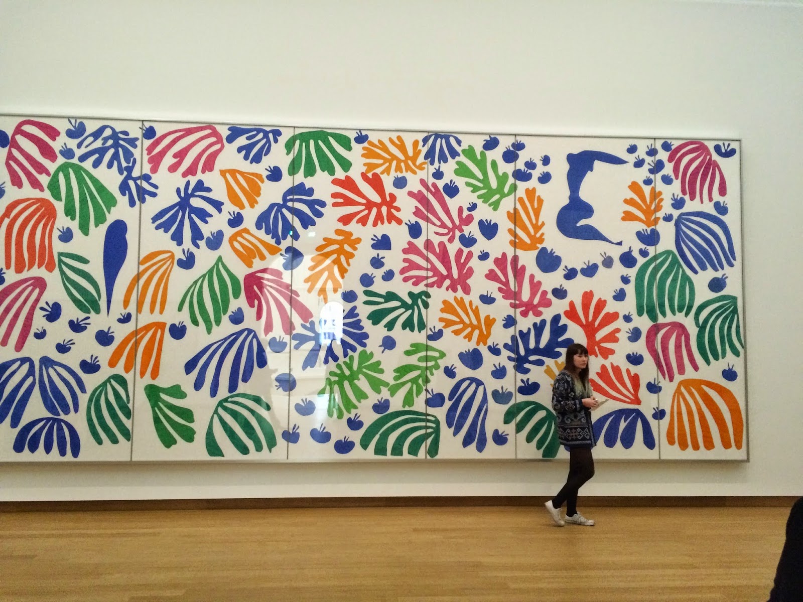
Back To Matisse:
Really nice calligraphic handwriting:

A famous print:

Matisse's cut outs are really inspiring. He uses primary colours well with such a basic form.


I would really like to create this sense of play in my work somehow.
Beautiful vibrance in the pop art section:


Some nice Pop art letters by Robert Indiana:


Some signage before leaving:

Conclusions
This has been one of my favourite museum visits, simply due to the diversity. I was able to see classic and contemporary art, as well as design all in the same place.
De Stijl - De Stijl's simple colour palette and basic form has inspired the minimalist inside.
Matisse - Again, his colour palettes have inspired me, but to be more playful and maybe more hands on with my work.