As I will be using the typeface for my logotype commercially, I've researched into possible typefaces to use, released by some of my favourite type foundries. I have a large collection of PDF's of typefaces released by Type Foundries, with a few of them selected and screenshot below.
Antwerp is not interesting enough for me:

CWM is highly structural which makes me think it's not suitable for my practice

Grot 10 isn't interesting enough for me as a logotype.

The same can be said for Italian Sans:

The same can be said for Recognition:

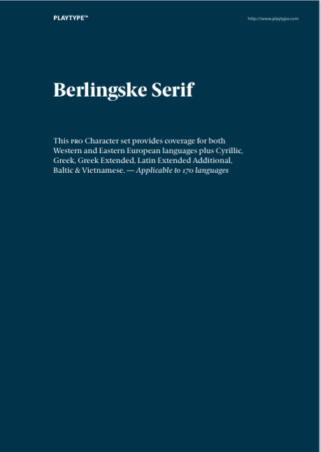
Berlingske Serif is one of my favourite typefaces at the moment, and I think it's absolutely beautiful. However, I still feel it isn't unique enough.


Domaine is another typeface I love. It has lots of quirky characteristics that I haven't seen similar of before.


I love the typefaces features, and certain think it will make my logotype stand out compared to other typefaces. The next test is to see if it suits my name:

I love how the letters look. There is certainly something unique in the curvature of the letters, and how the J, a & r have been tapered off. The next step will be to customise the logotype and make something unique to me.